This blog was written when I was the creative director at magenta.
Less is more. It’s the mantra that’s kept us thriving in the world of B2B communications for a decade.
Although we’ve applied the principle for clients, we felt it wasn’t communicated in our own visual identity. So we’ve treated ourselves to a rebrand to make sure we stand out in the sea of corporate blandness.
We’ve retained our tagline – fresh thinking – because that’s the essence of what we do and framed it in terms of subtle disruption – because that’s what we deliver for clients.
Using our values – honesty, integrity, creativity, and agility – we formulated a creative brief. A few thousand scribbles and mind maps later we crafted our digital first approach with an emphasis on being bold and authentic.
Typography was an important element and our visual starting point. We retained our existing stamp and wordmark. The ‘m’ encased in a circle seamlessly is the root of our brand language. Playing with patterns and typography was a fun exercise. Using a font that was platform agnostic, had softer corners, and worked well at scale as well as fine print, was a no brainer.
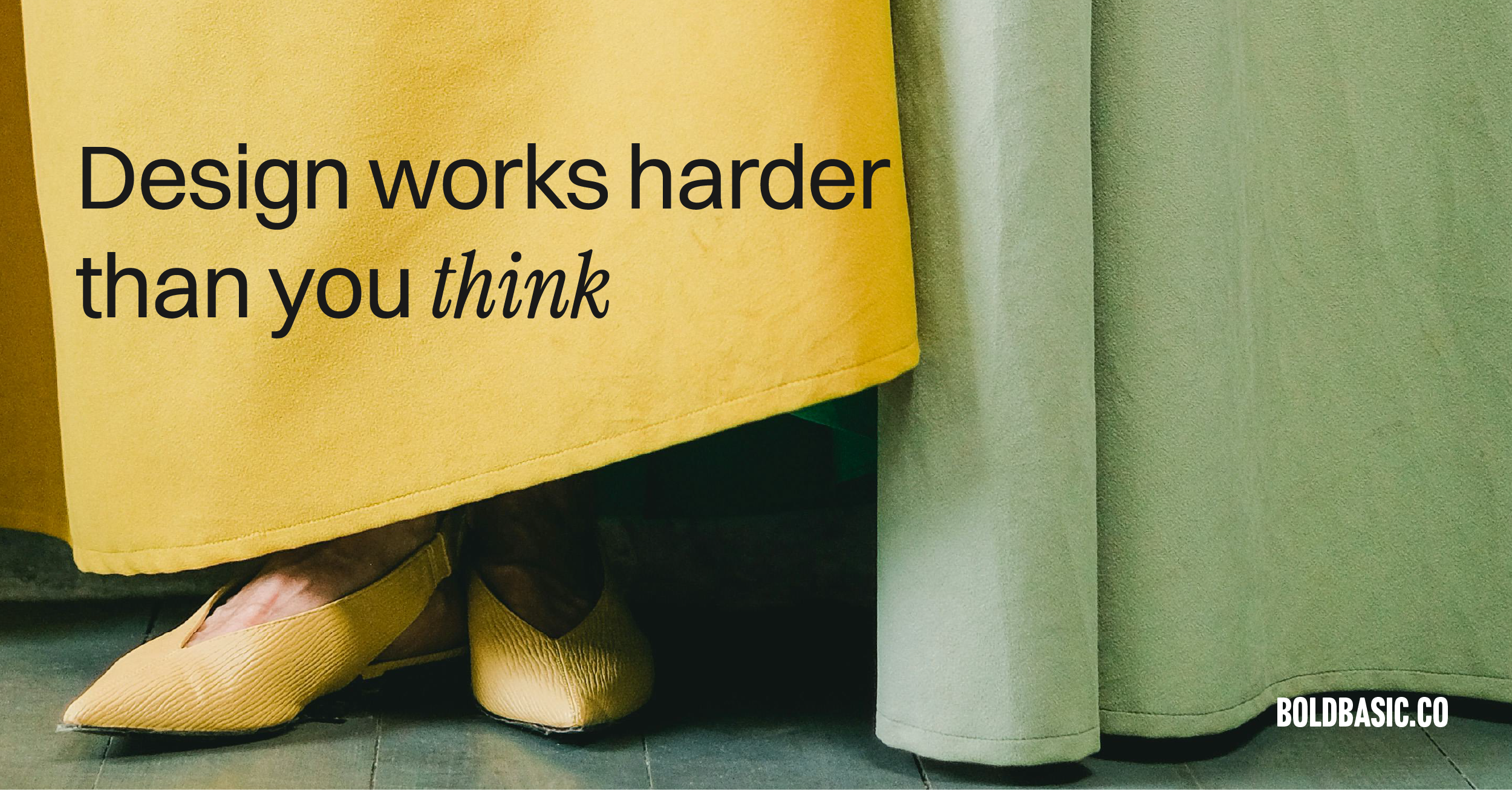
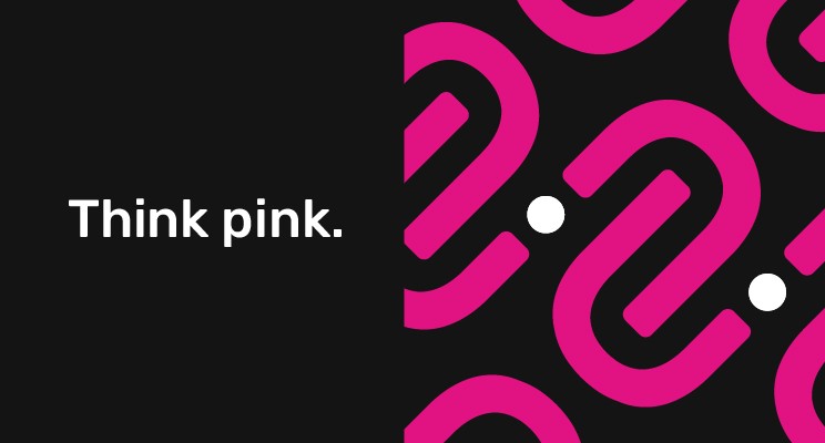
By adding to our eponymous magenta some warm yellows, green and greys, we created a high contrast yet complementary colour palette.
The way we now show our work is bigger and brighter – we didn’t want to shy away from displaying our achievements or acknowledging the fantastic clients who’ve helped us along the way.
You can see how this came together on our website, our creds deck (if you’ve been so lucky to receive one), and our revamped ‘mind over chatter’ newsletter (subscribe here).
Our new identity is vibrant, credible, and reflects our values. It is testament to the mantra that’s underpinned the past decade and will sustain us as we enter the next.
…
If you’d like a brand refresh for your business – my brand essentials package will be perfect!