A curated collection of bold branding, beautifully crafted publications, and strategic website designs—helping clients communicate while looking damn good.
I’ve had the chance to work with some brilliant clients on projects I’m pretty proud of. I’d love to show these off to you.
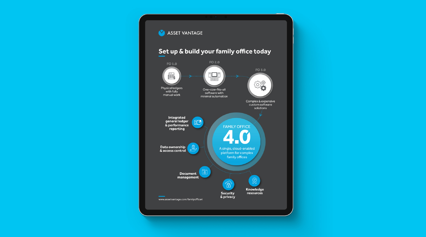
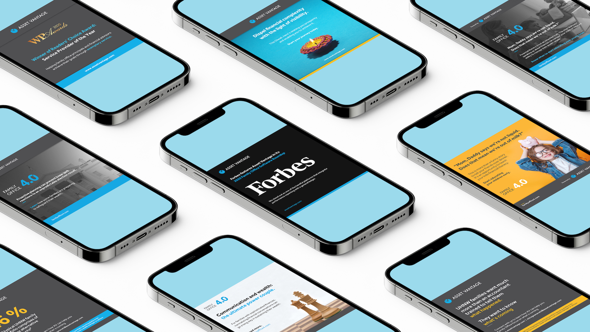
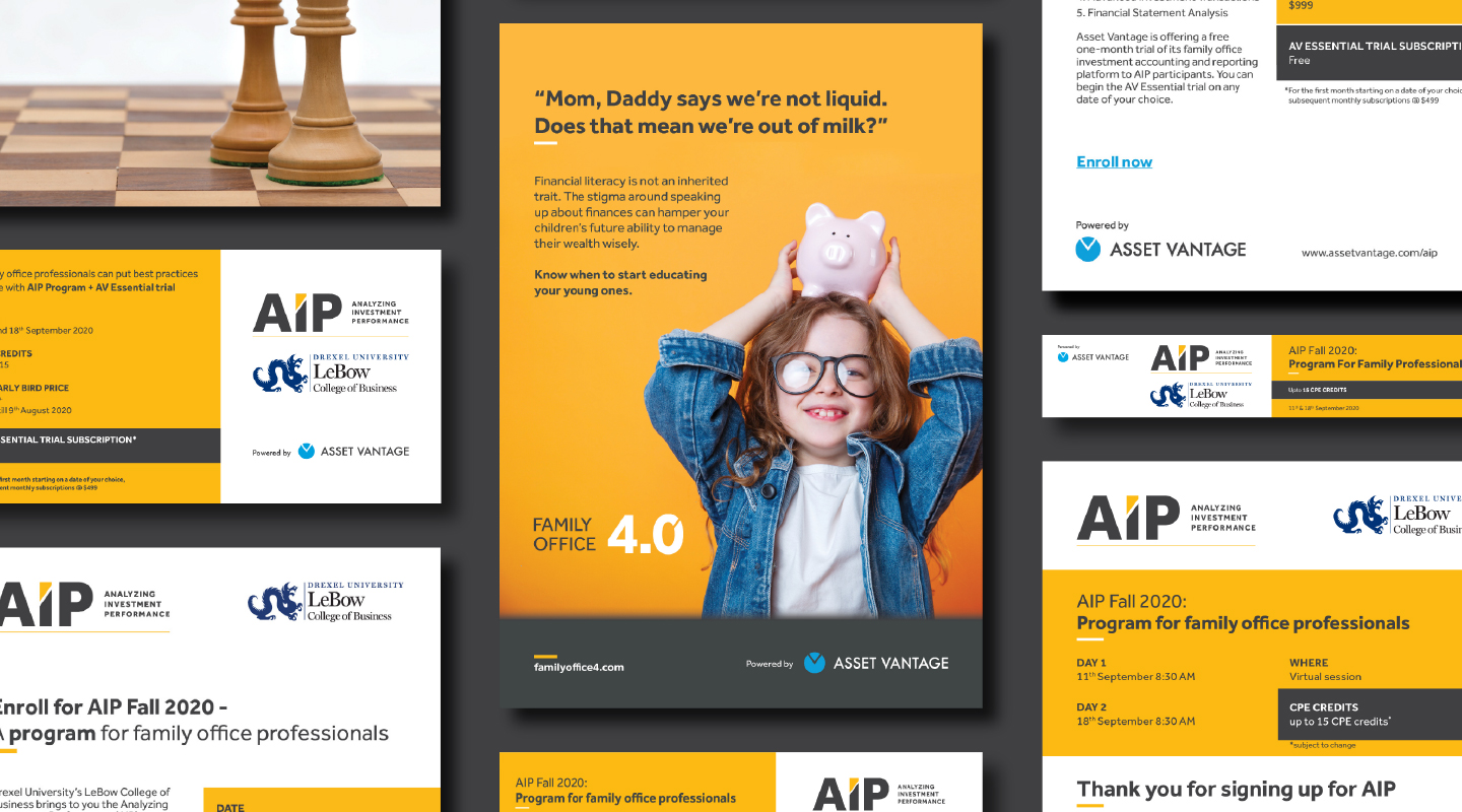
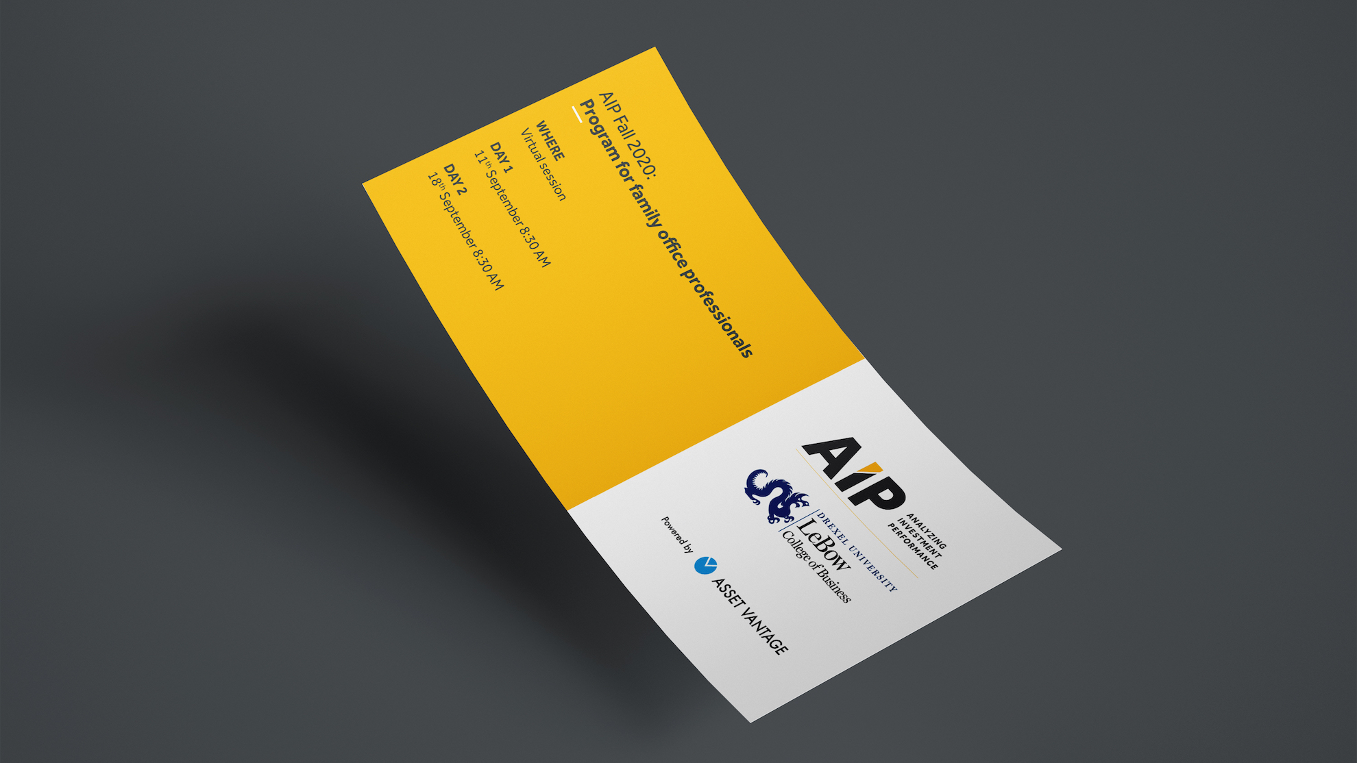
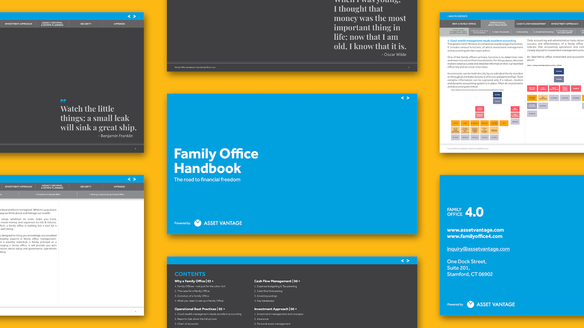
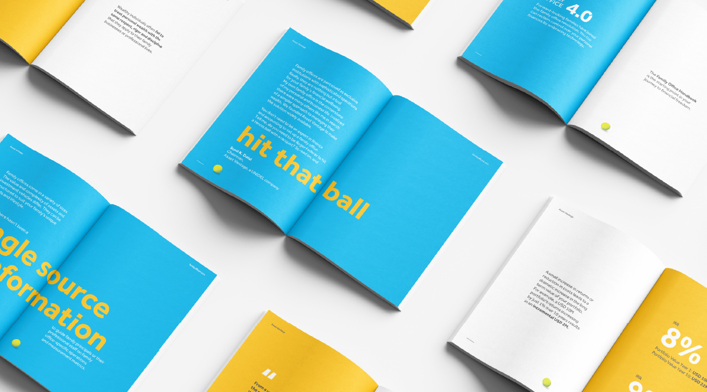
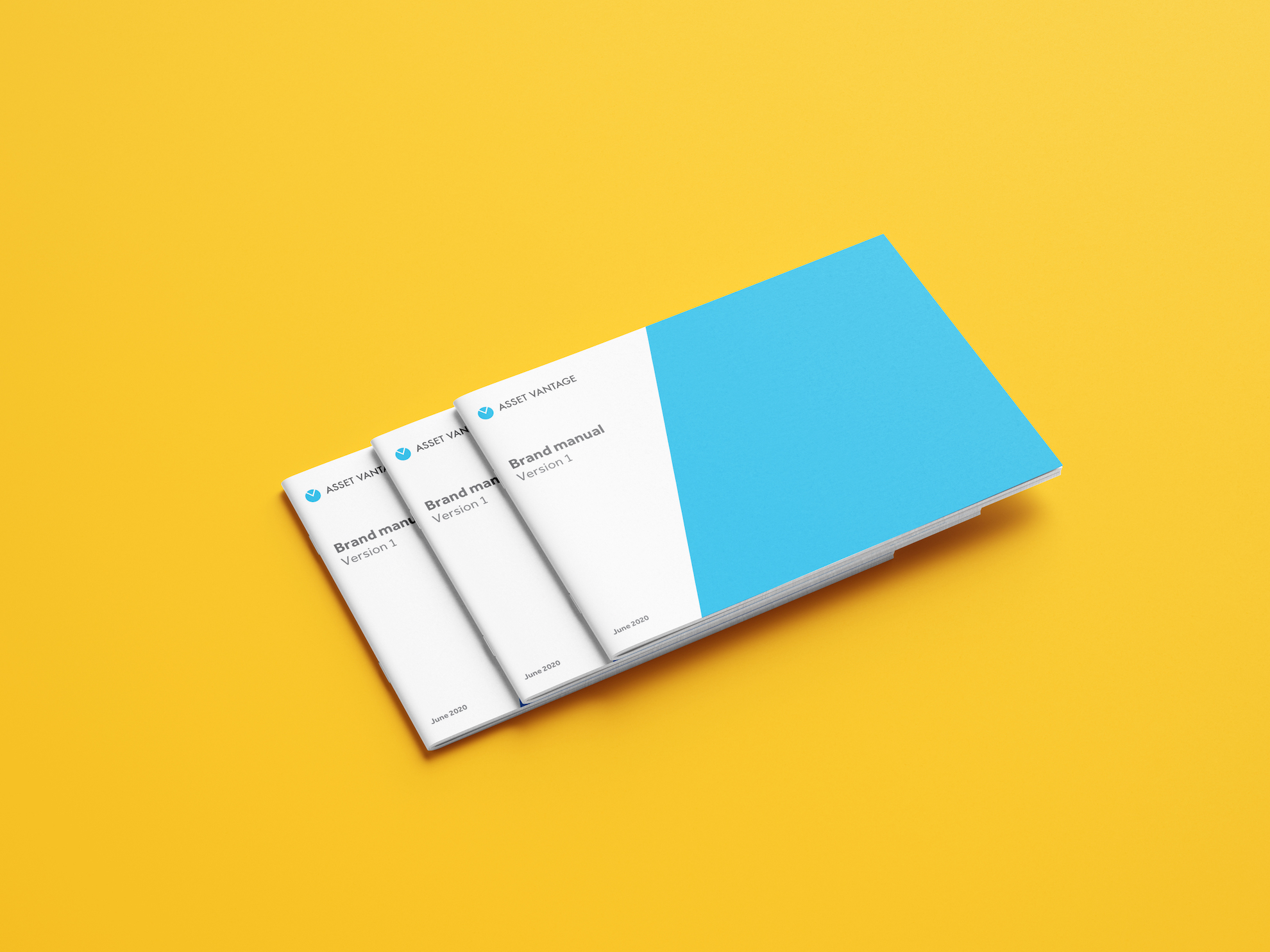
A cloud-based fintech solution company, Asset Vantage caters to the needs of family offices globally. Apart from breathing life into their communications, we worked with the founders to tap into their wealth of knowledge to create Family Office 4.0 – a ground breaking thought leadership platform. We developed a distinct style to create a must-have handbook for family office professionals.
My approach was to use the existing brand elements to elevate their visual communications, and establish their credibility and authority as pioneers in the family office ecosystem.
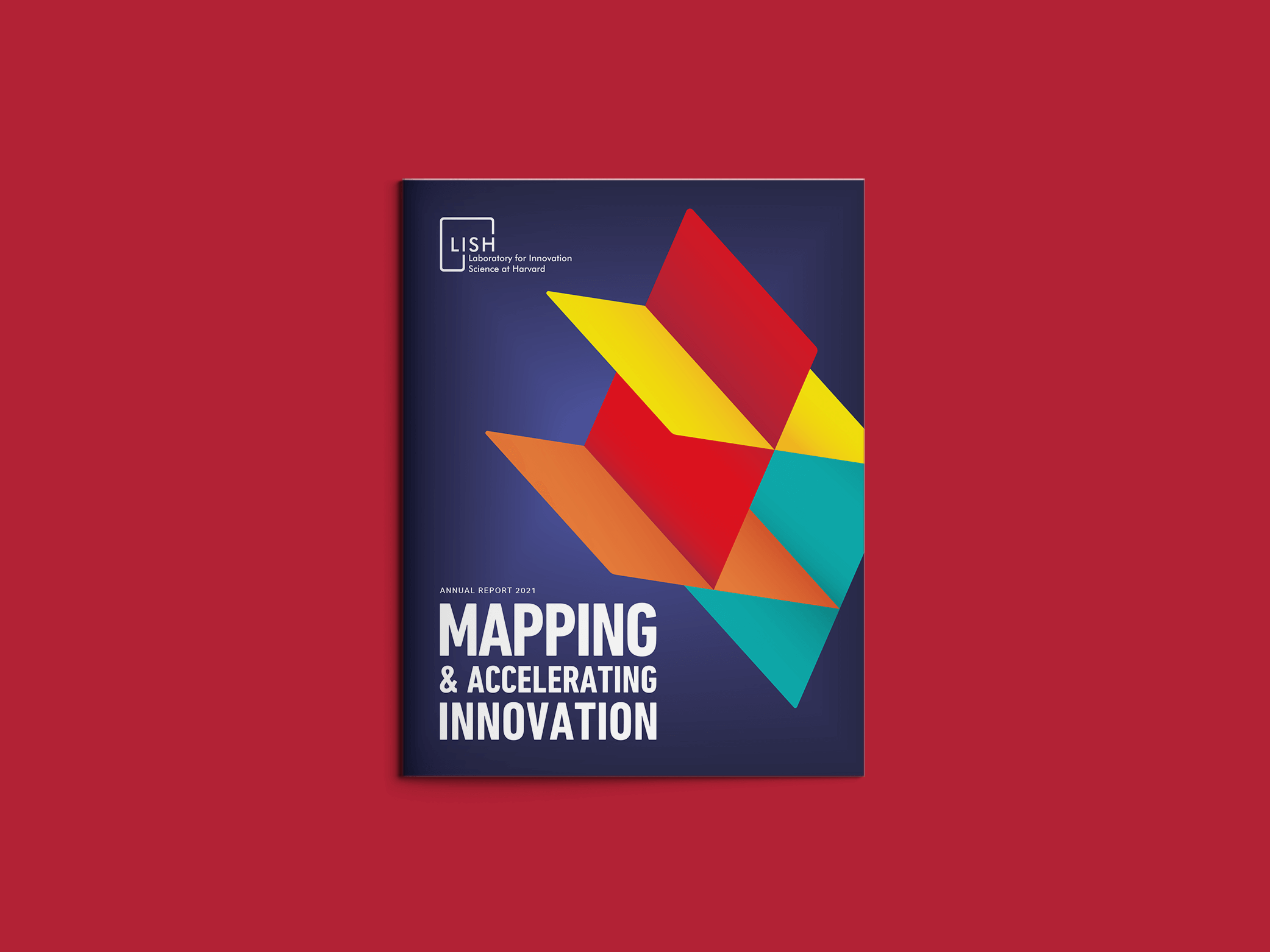
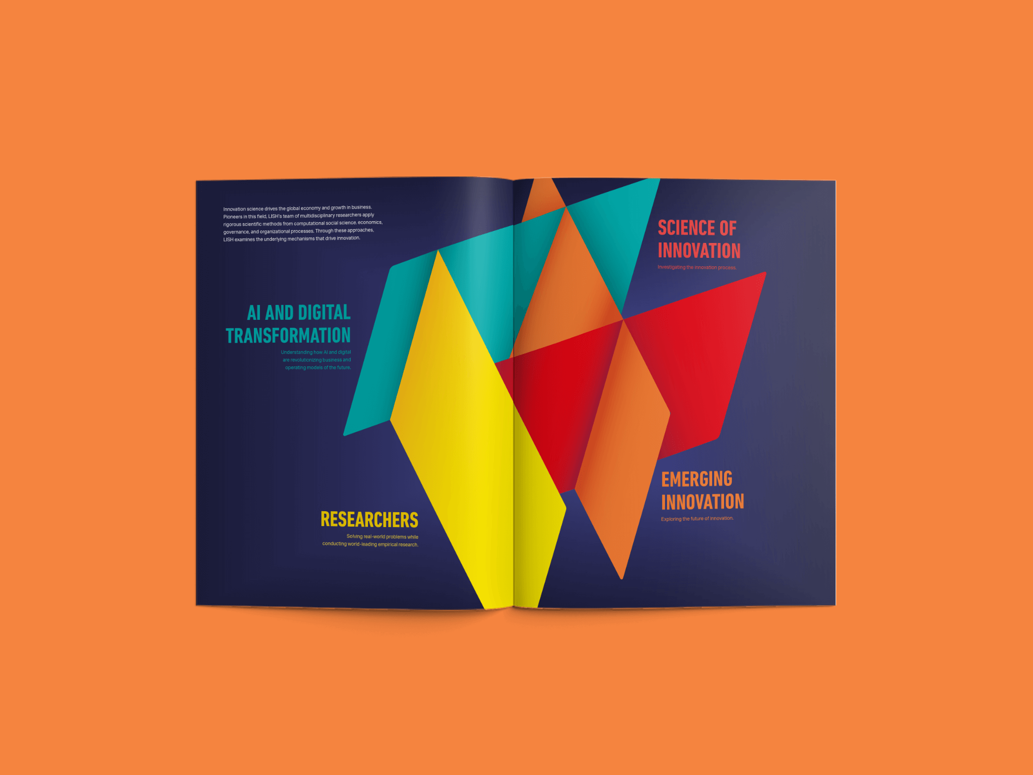
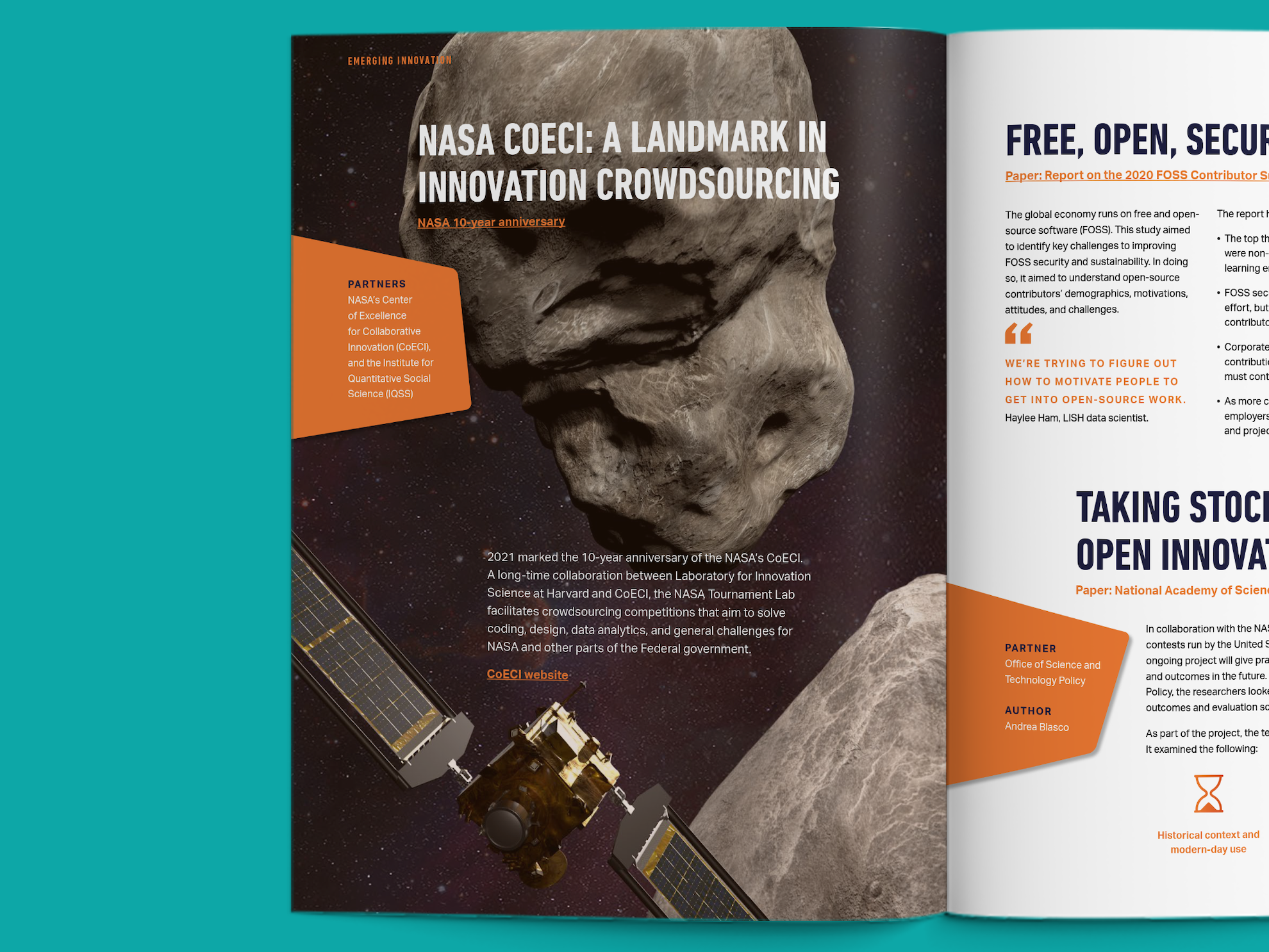
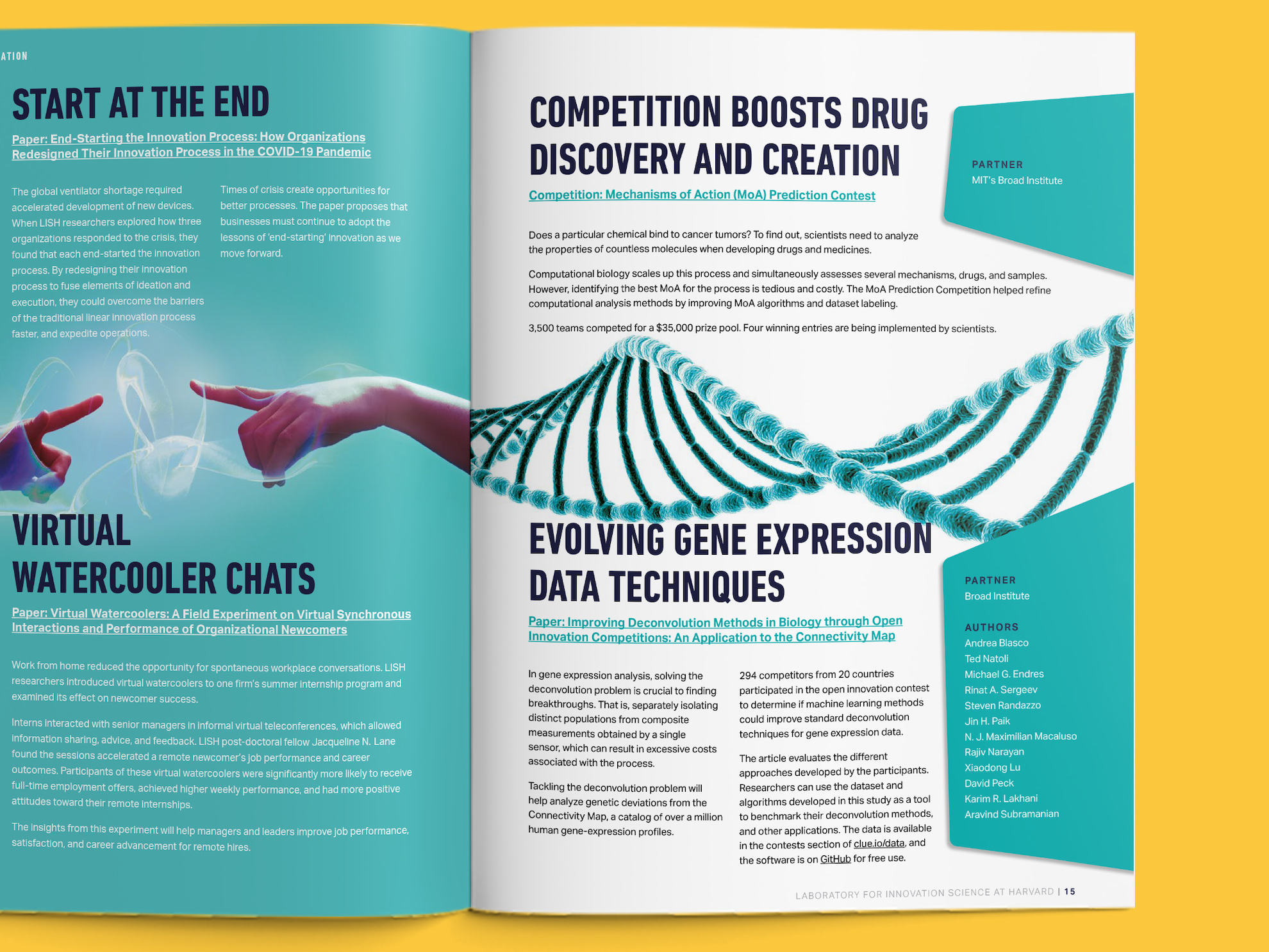
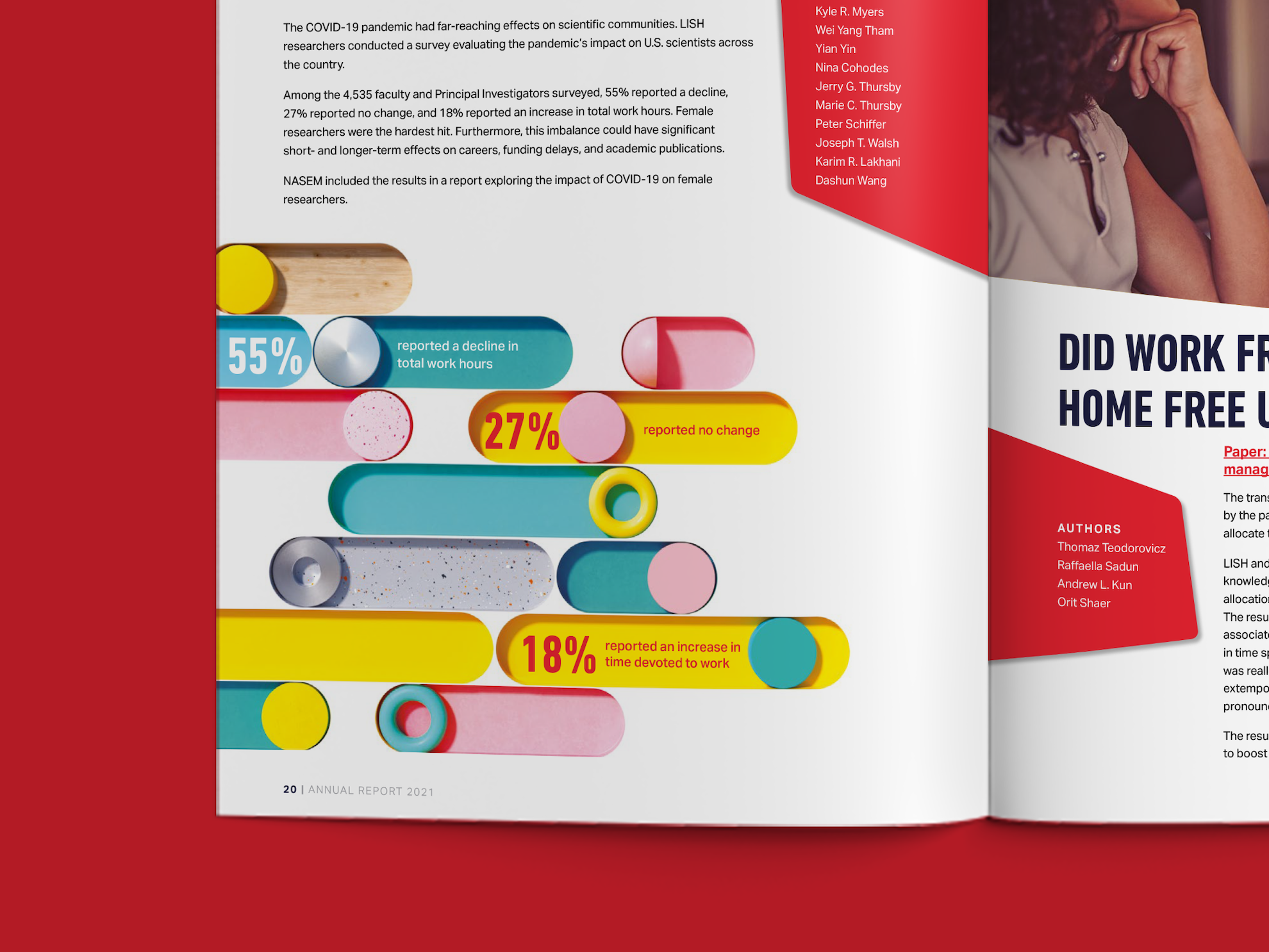
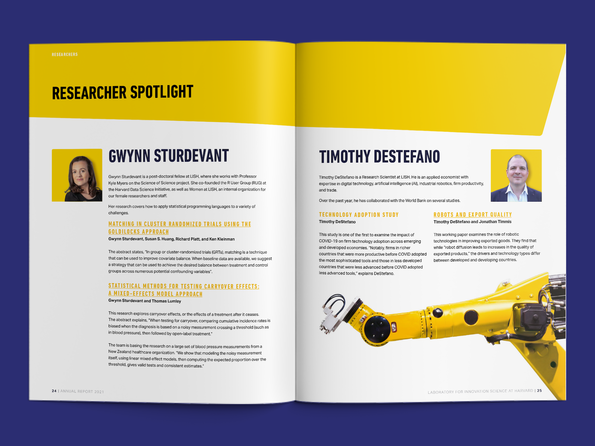
Much of the work done at LISH exists at the intersections of science, business, and society. This gave birth to the ‘un-box’. It’s a dynamic structure which can be viewed from any angle and the planes intersect at different angles. The structure gave us a system for organising the report. Colour was used to separate the four sections. The deconstructed box provided a set of shapes that form spaces to hold information as the sections unfold. The page template is versatile and accommodates varied content. A blend of stock imagery, illustration, and photographs of real people gives pace and character.
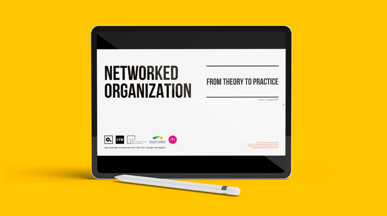
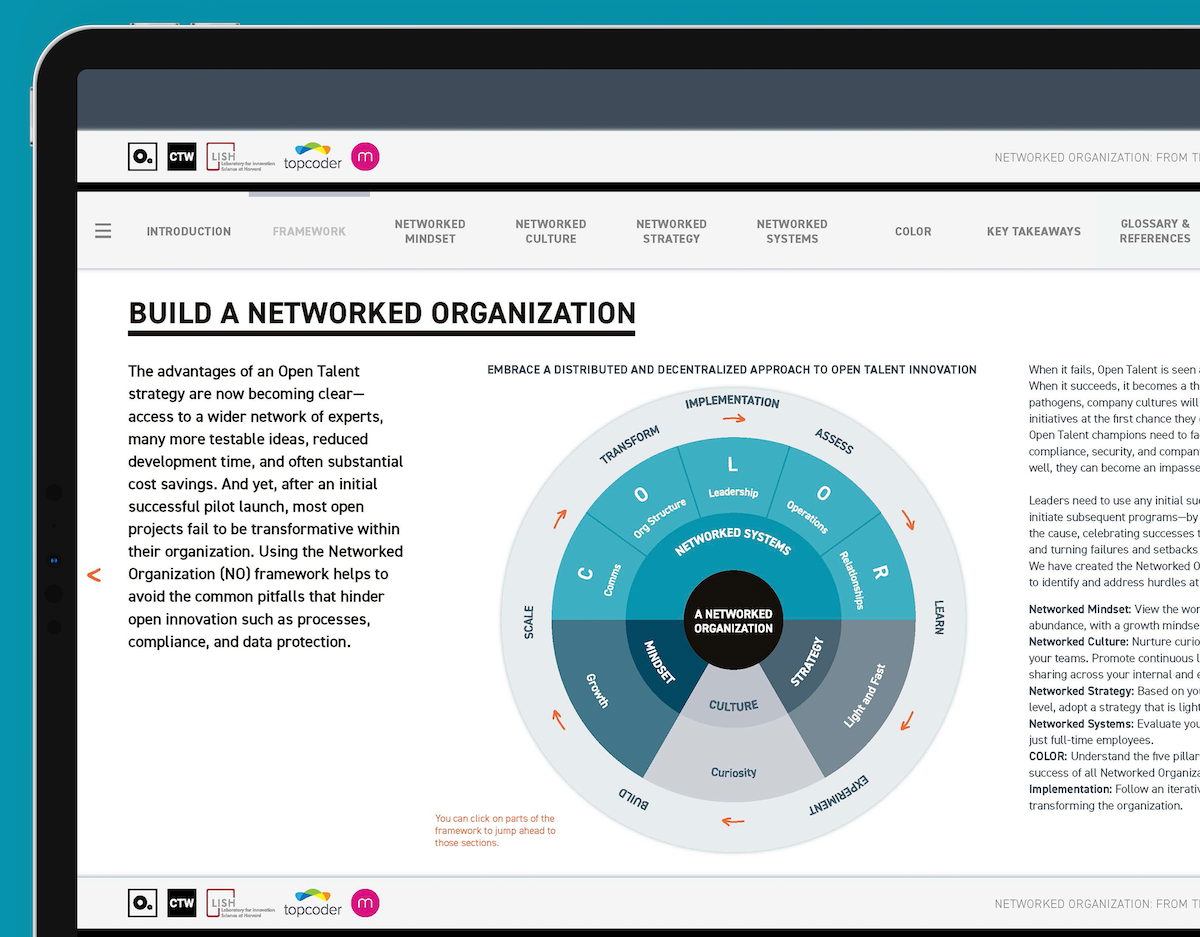
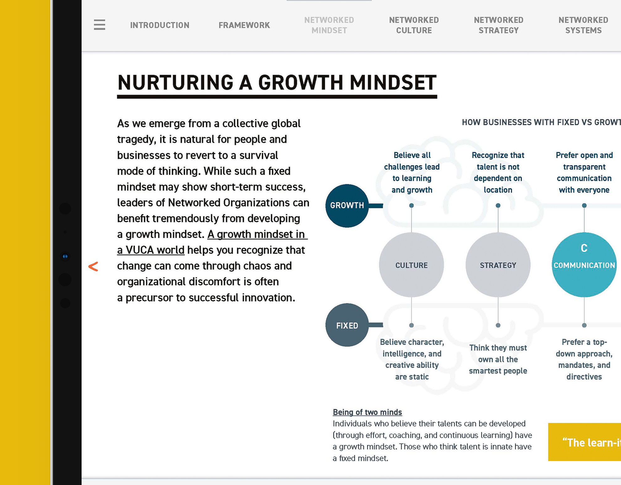
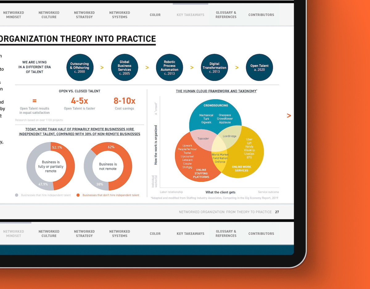
Organisations need the right tools to tap into the global workforce ecosystem. Filled with meaningful principles and case studies, the playbook gives a step by step guide on how to build a networked organisation. Taking inspiration from OA’s previous publications, I chose an interactive PDF with clean and minimal design. Easy to navigate, it is an example of open talent in action – teams across the USA, Europe, and India worked together for the first time in dedicated sprints. This publication is a part of an online course at Harvard Business School taught by Professor Karim R. Lakhani.
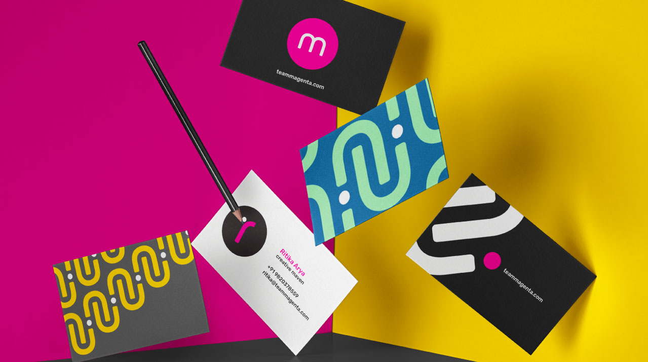
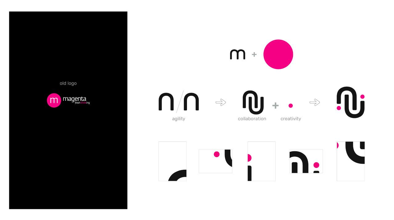
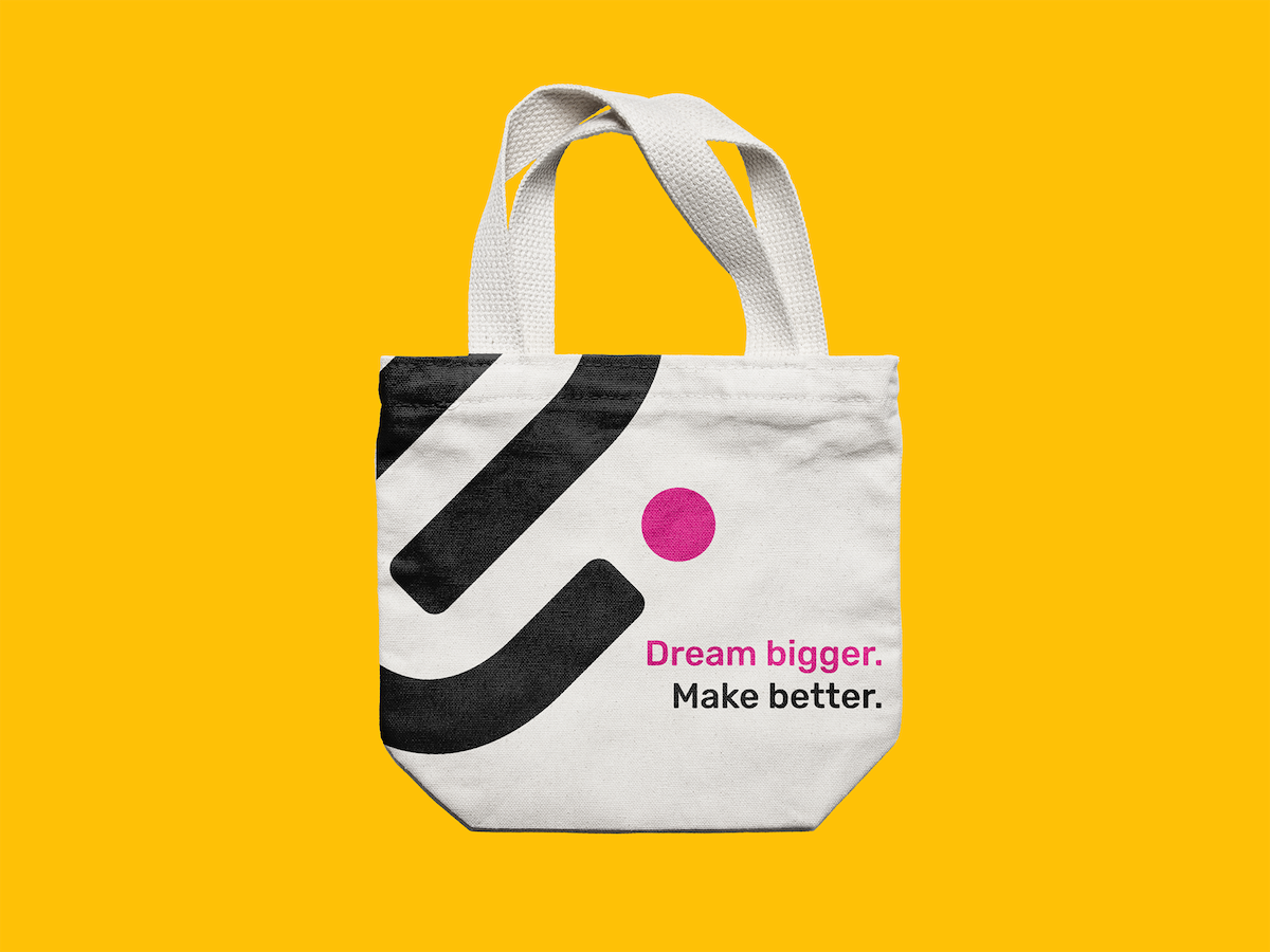
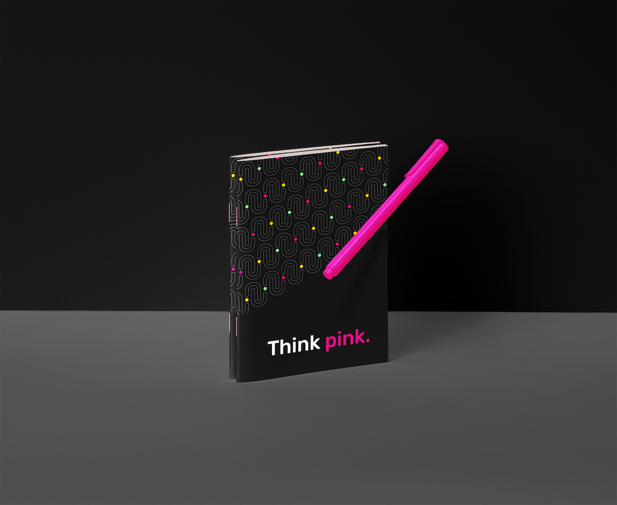
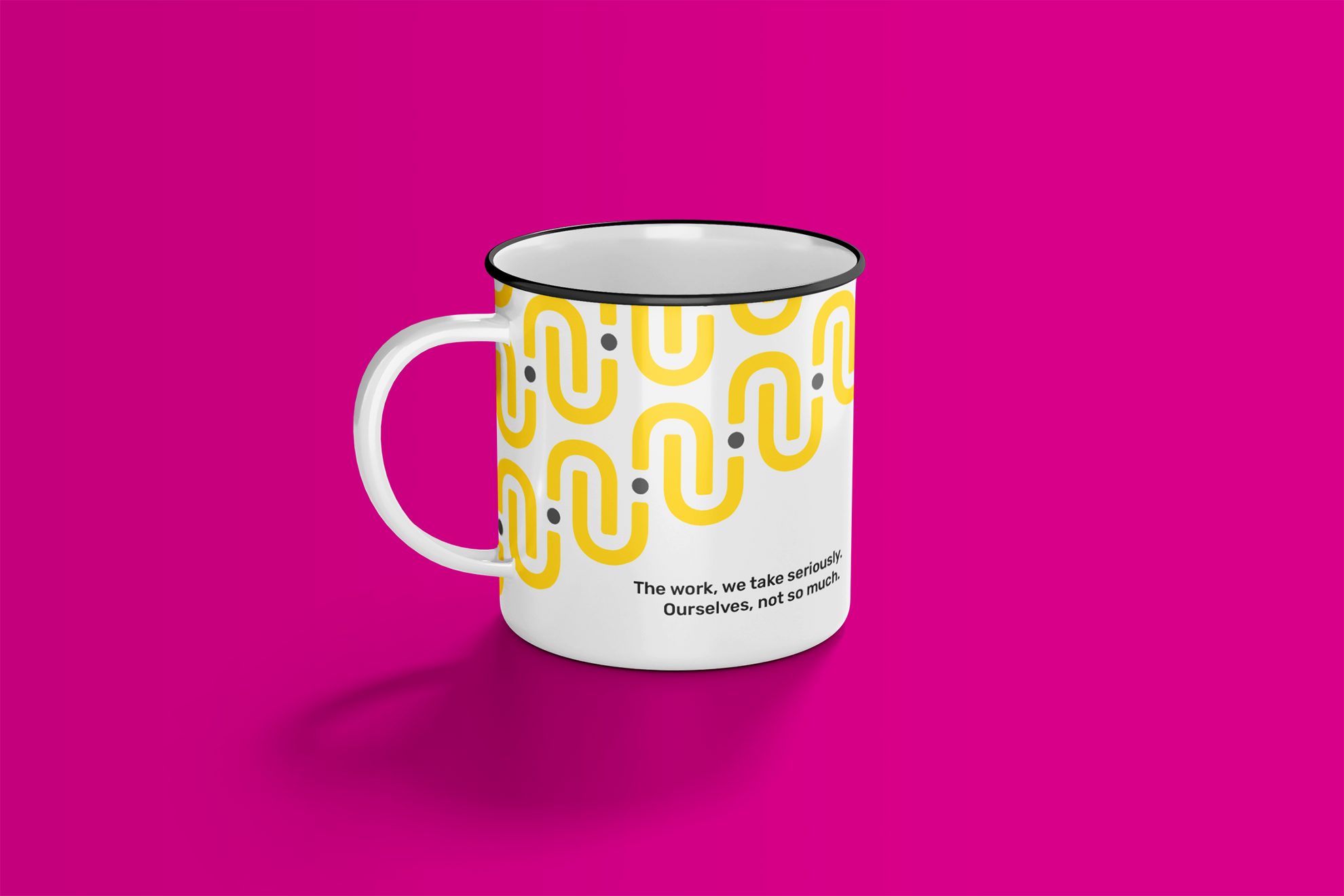
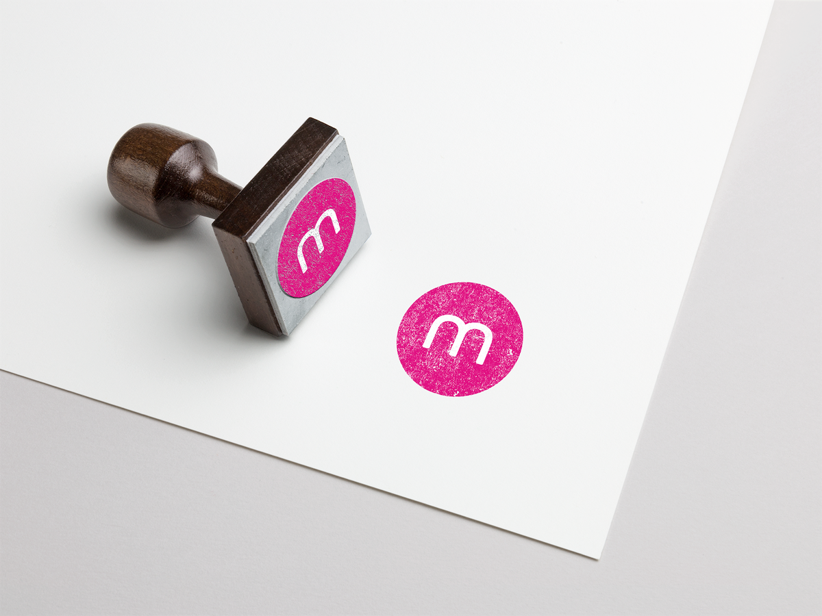
After creating B2B communications for over a decade, magenta needed to rebrand. Retaining the original stamp and colour, I represented the studio’s values visually – agile, collaborative, and creative. What emerged was a playful system of brand elements rooted in typography. I wrote about the process here.
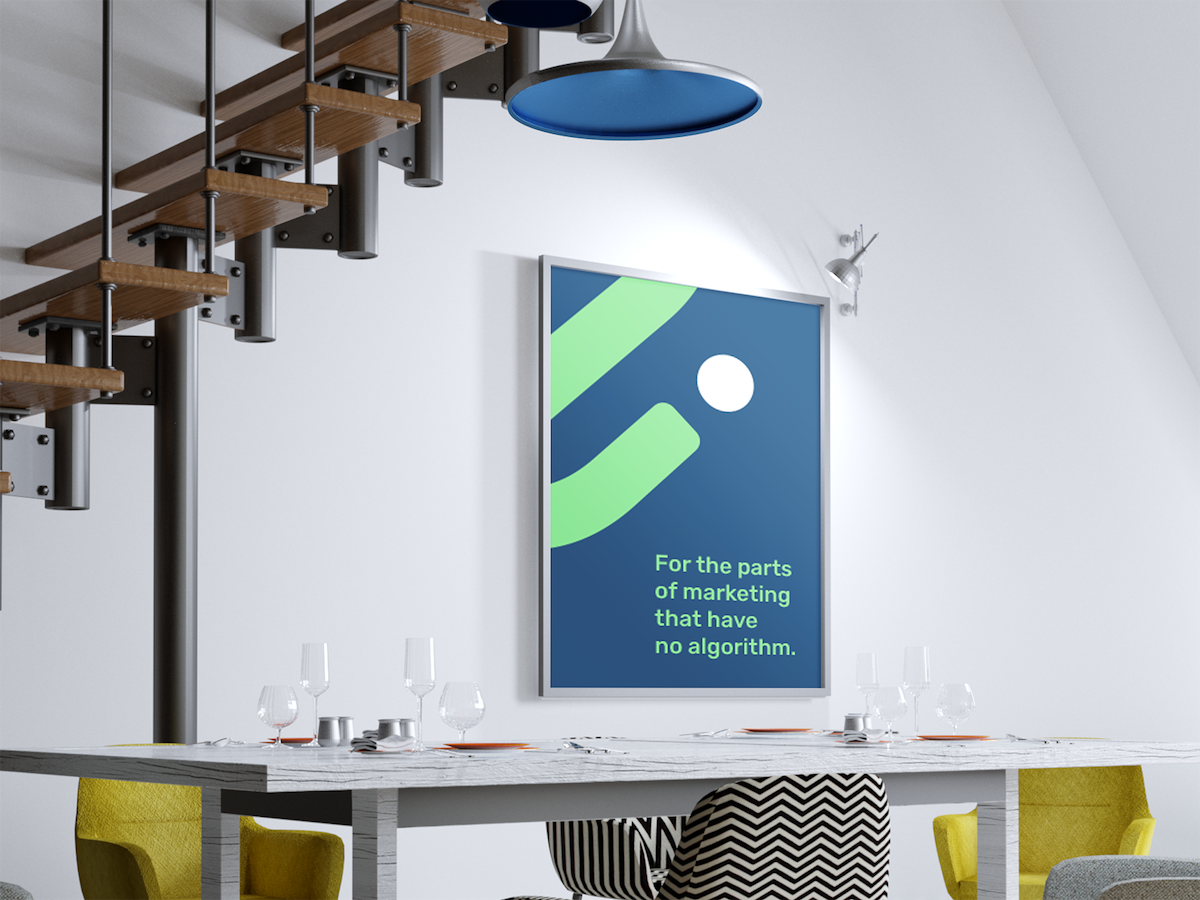
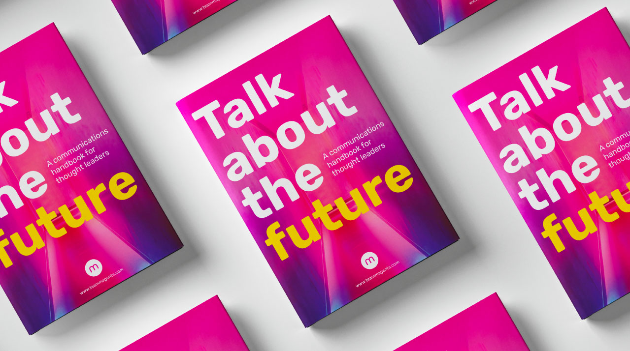
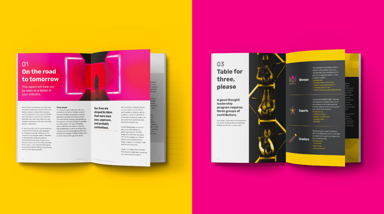
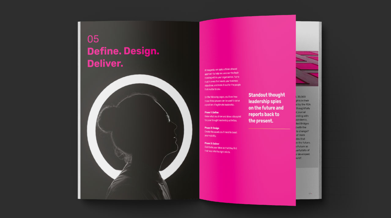
With the rebrand, magenta wanted to establish itself as a communications partner for thought leaders, which gave birth to the communcations handbook. Putting the new brand to work, I used powerful imagery and strong colours to talk about the future.
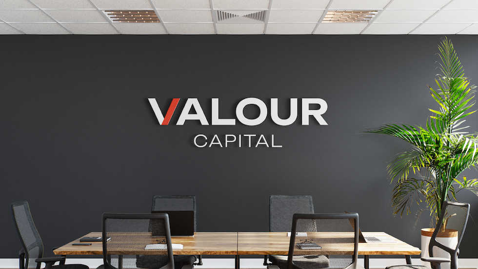
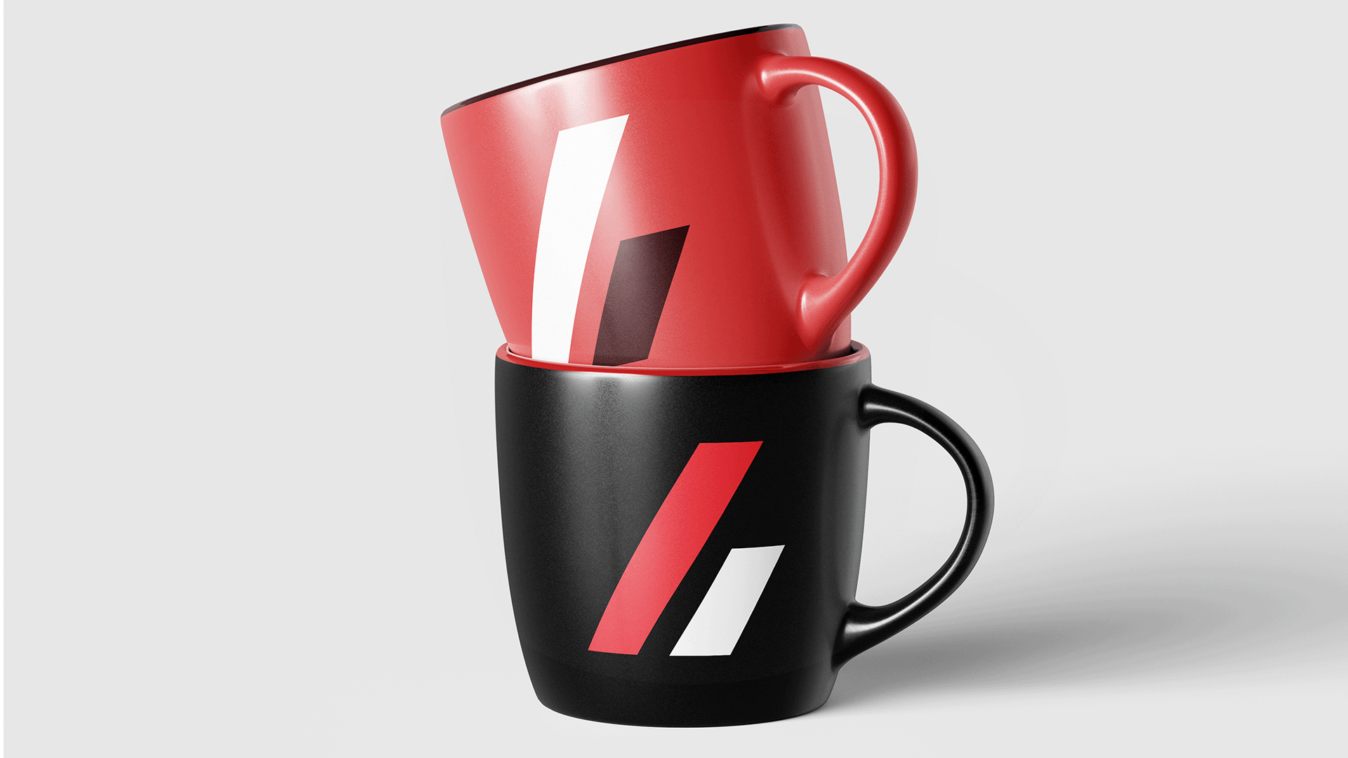
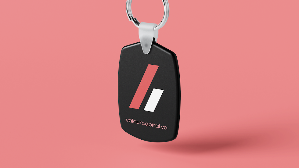
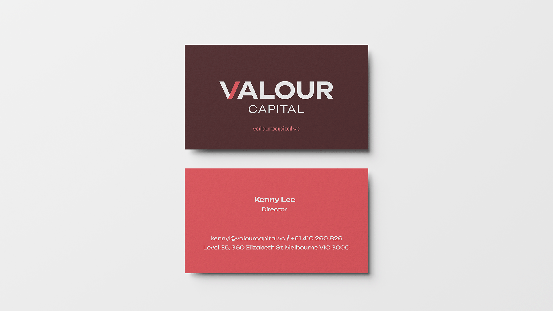
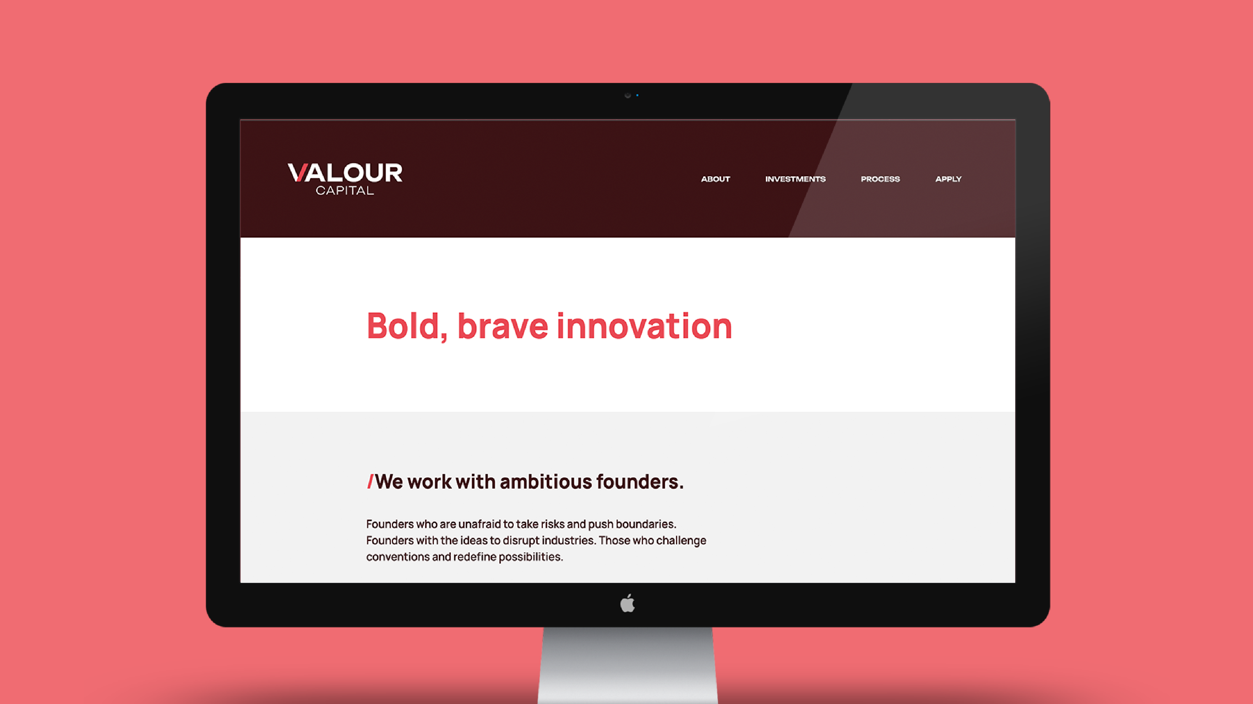
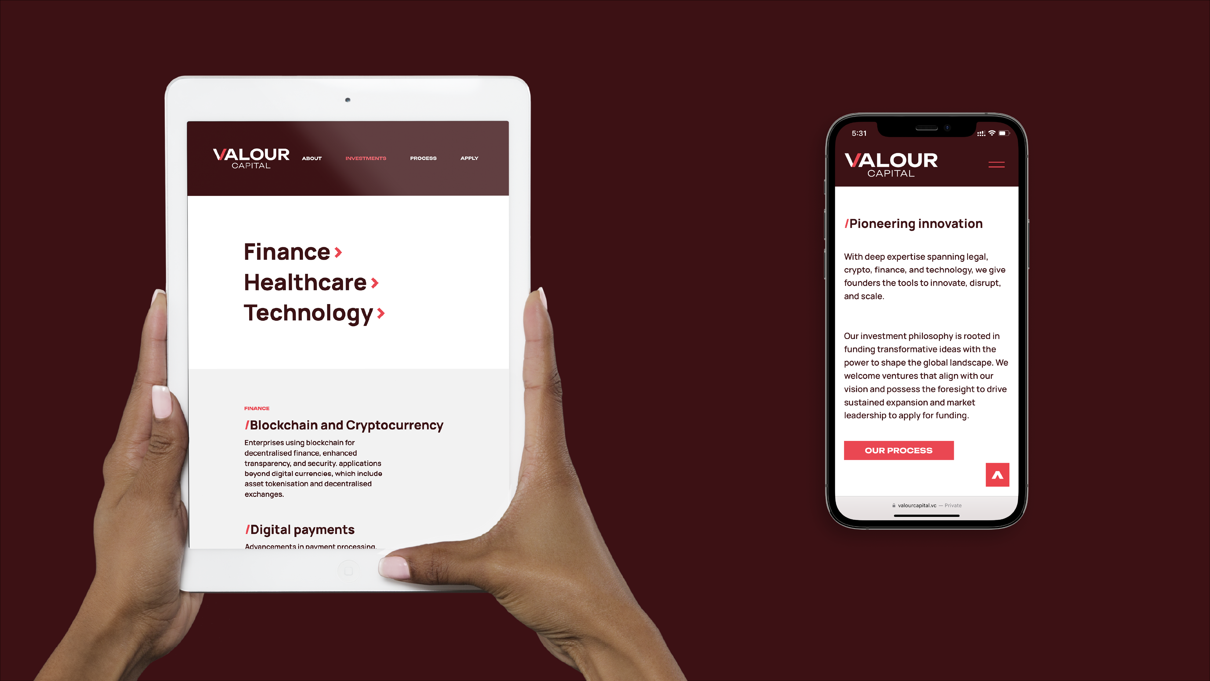
Valour Capital is a young venture capital firm backing fearless founders. With a sharp focus on early-stage investments, their brand and website needed to capture ambition, energy, and clarity.
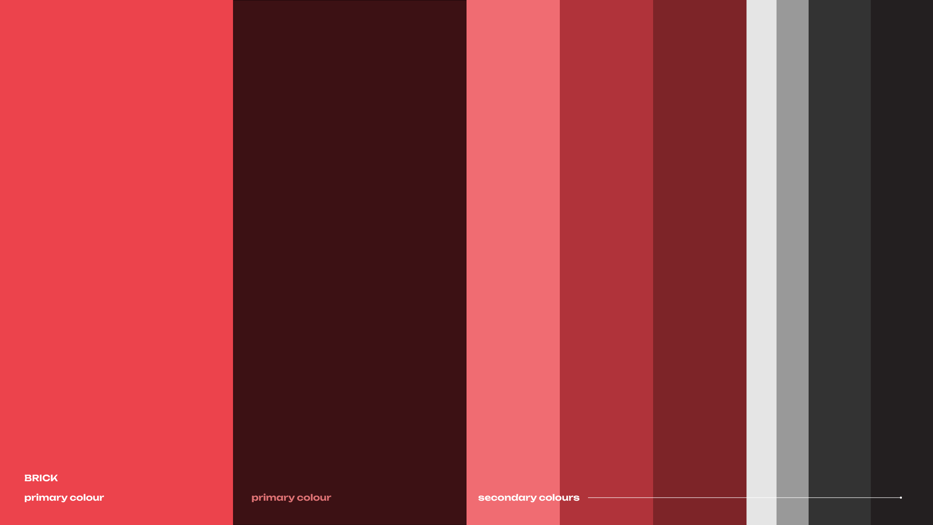
Working closely with the founding team, I developed a bold identity – centered around the upward-moving slash, symbolising growth and momentum. I brought on my truster partners – copywriting & web development – to complete the project. The website was designed to be clean and direct, speaking to young entrepreneurs without unnecessary complexity. The brick-red palette reinforces their commitment to brave investments and standout founders.
The result? A brand that feels confident, future-focused, and ready to scale.
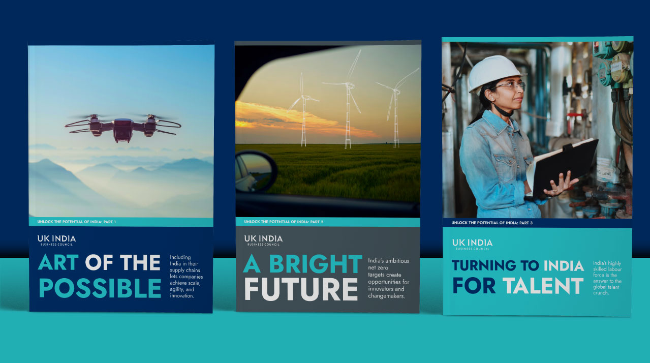
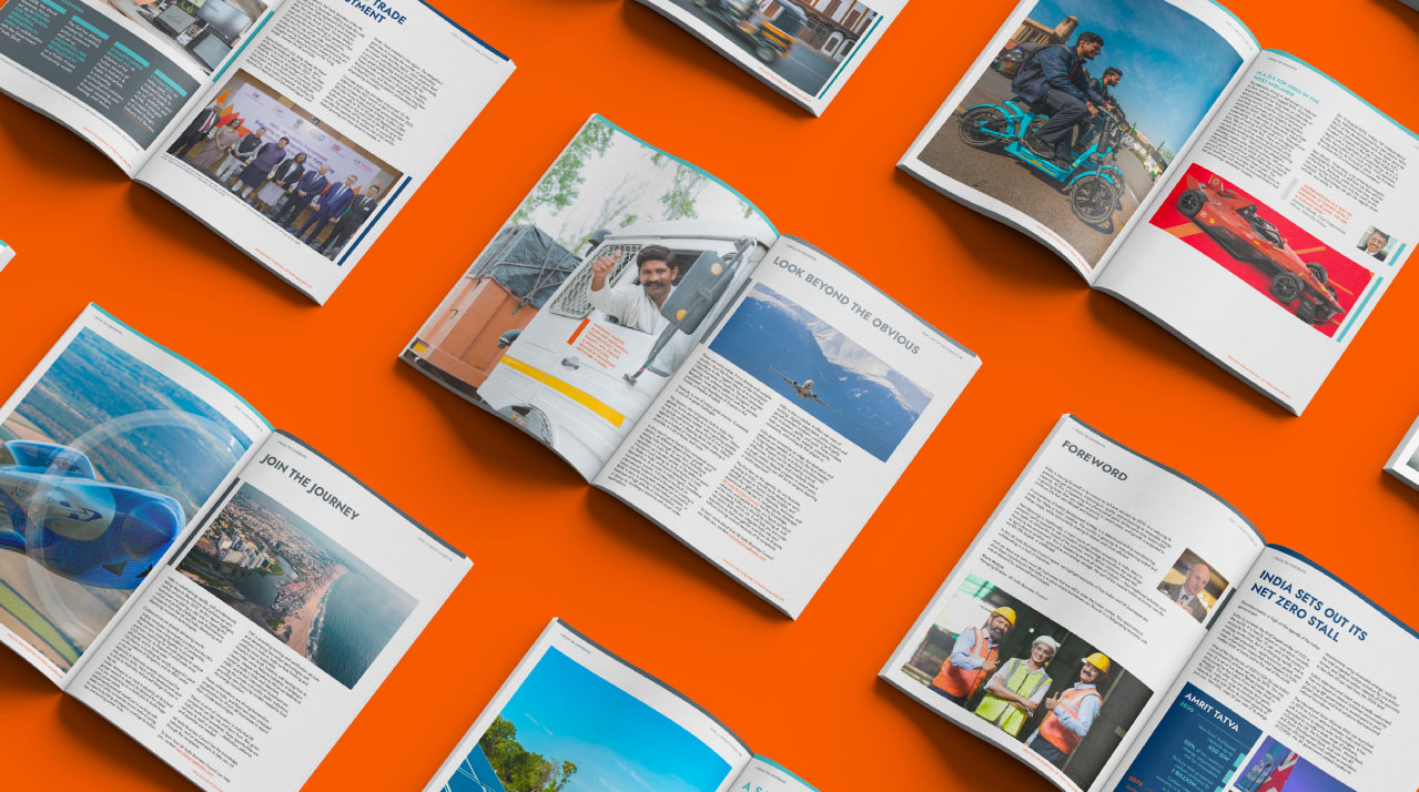
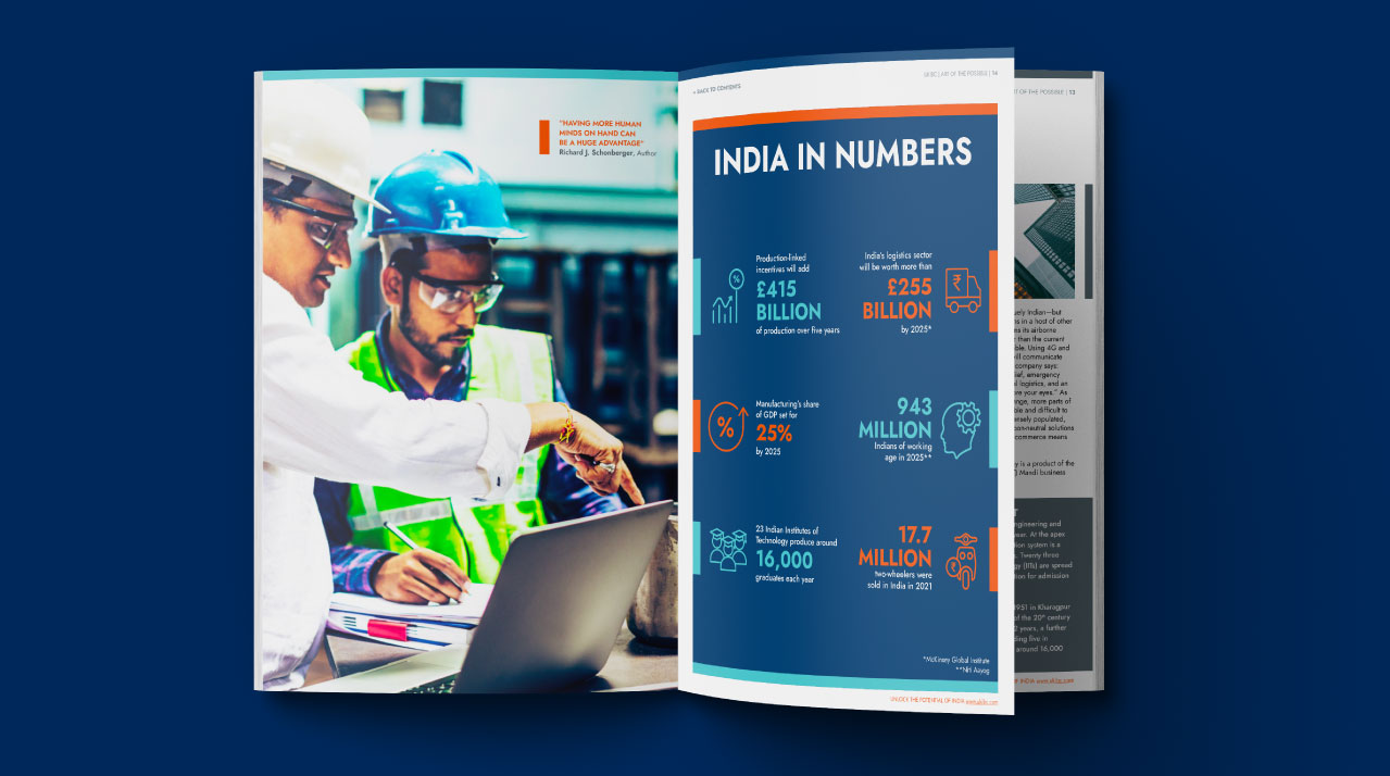
UK India Business Council (UKIBC) promotes business between the two countries. They provide insights, advocacy, and consultancy for UK based companies looking to grow in India. We produced a series of reports that discuss the multitude of channels to unlock India’s potential. These publications build on the exisiting visual style of the brand, and elevate it. A combination of real life imagery, case studies, and solid data make for an interesting read.
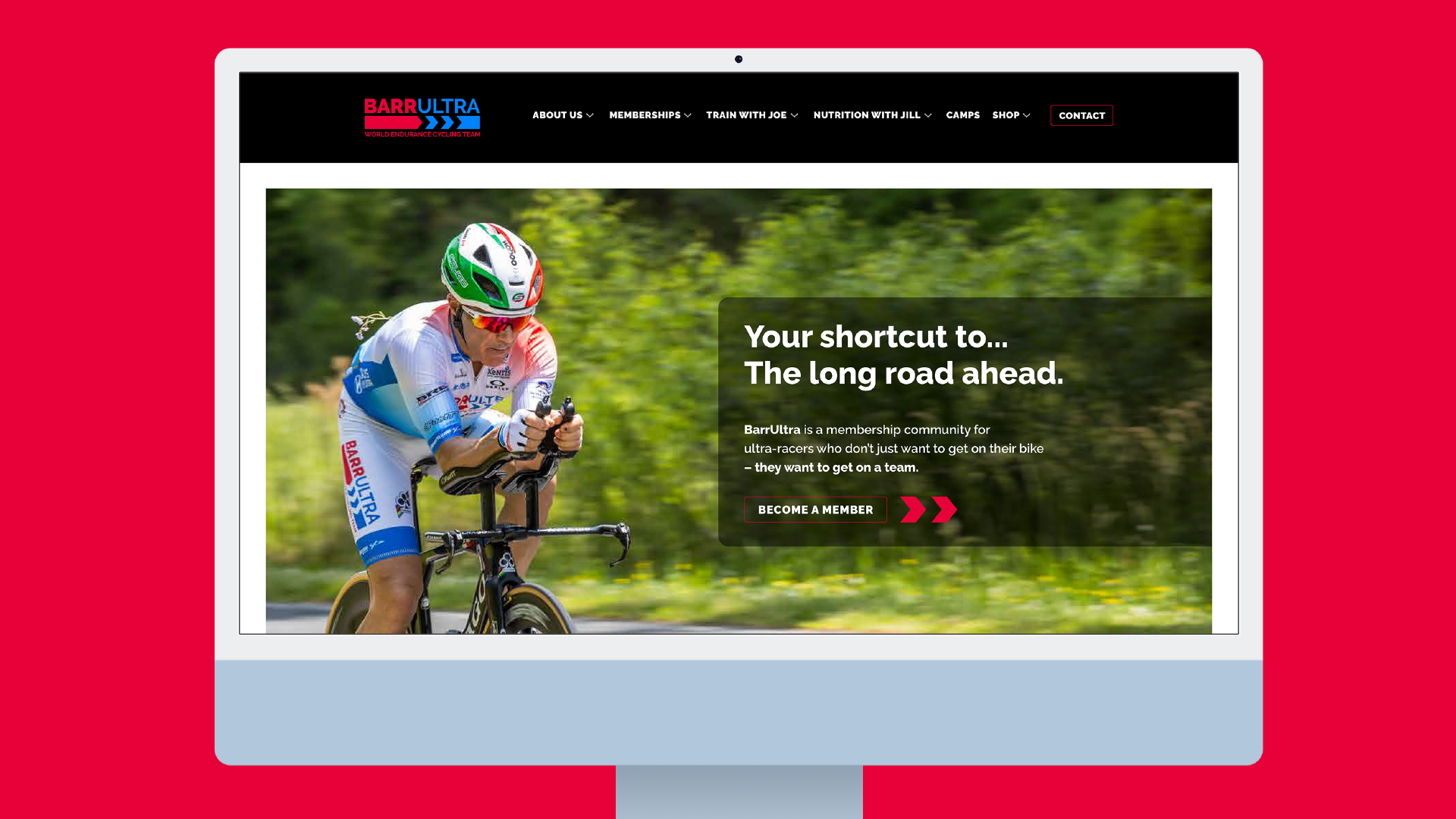
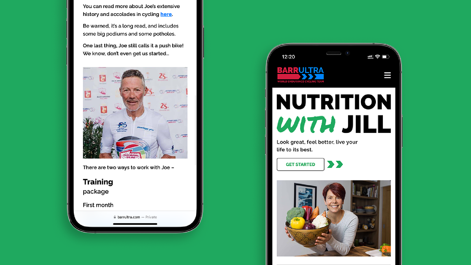
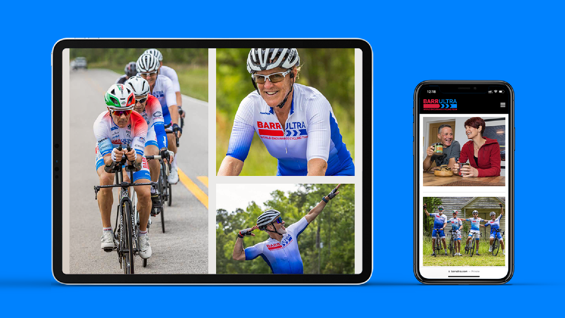
BarrUltra is a membership community for ultra-cyclists. Started by Joe Barr, Jillian Mooney, and Marc Poland – it’s the shortcut to the long road ahead.
Using the existing recognised logo, I developed a minimalist visual identity across all platforms giving the brand a unified home. Pairing powerful imagery with clean typography we achieved the goal of simplicity. Applied the principle of less is more to create an ownable design system, enhancing user interaction across their global platform. Also branded Nutrition with Jill as both an independent entity and under BarrUltra. User friendly onboarding documents added consistency to the entire brand experience.
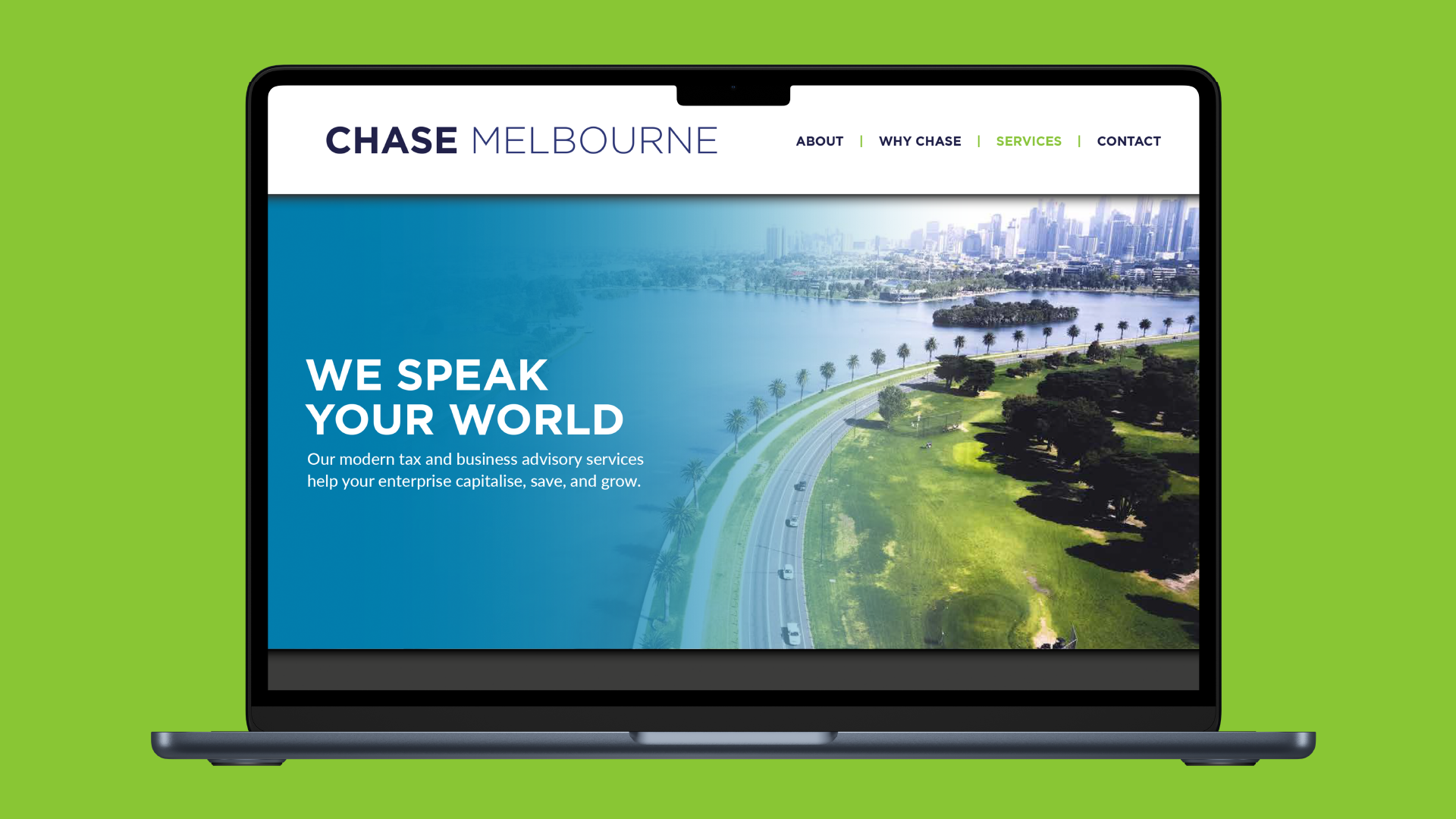
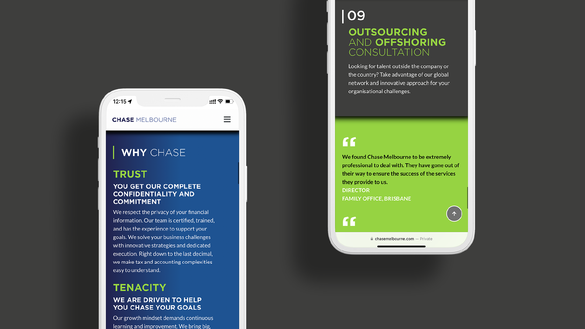
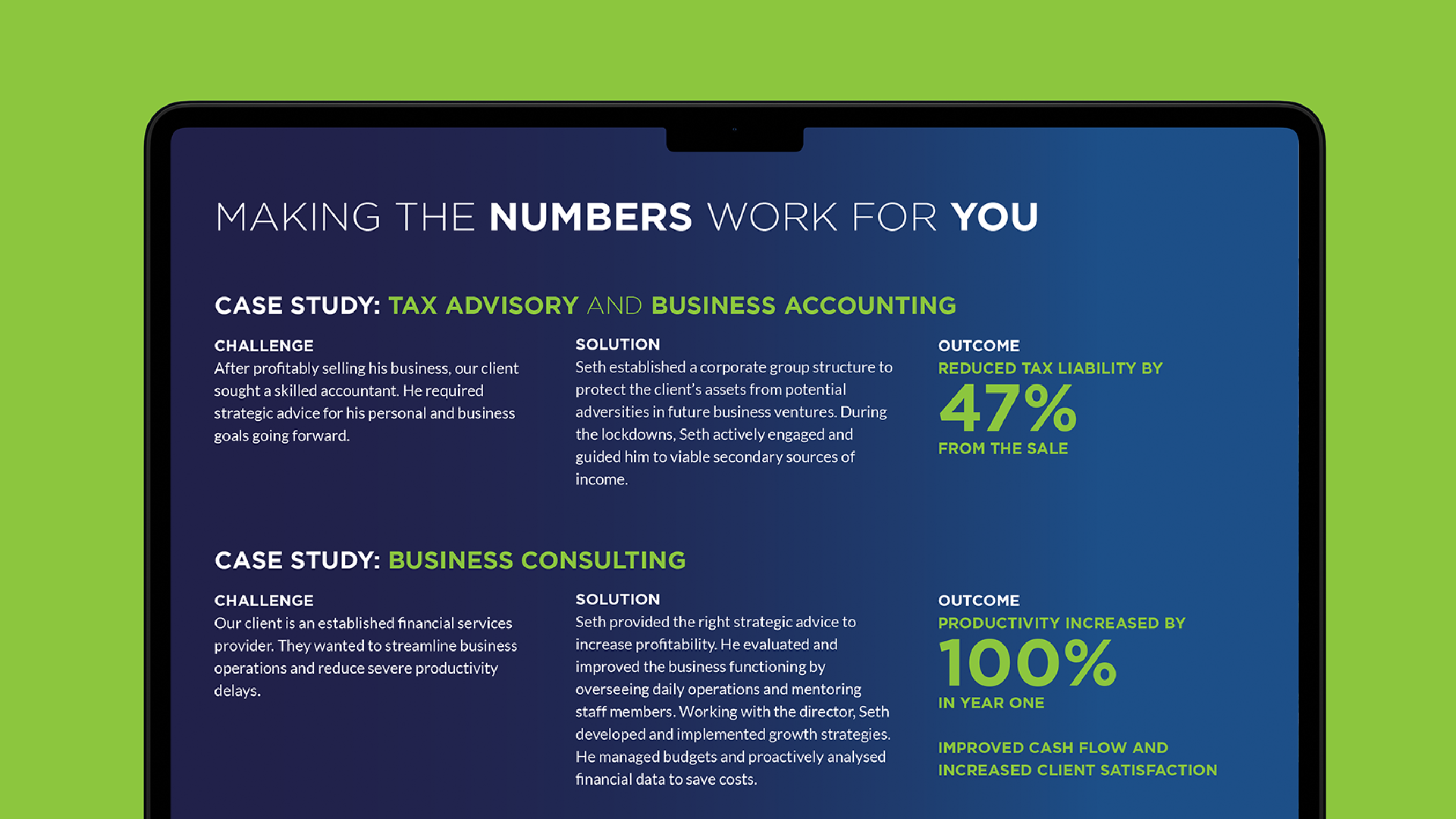
Chase Melbourne is a tax and advisory business led by a young accountant. With a growing list of high net worth clients and services, the website needed to reflect the new business direction.
Working directly with the Director, we launched a redesigned website while I managed the project across multiple geographies. Led a team of designers, writers, and web developers. There was a boost to lead generation by 40% and increase in business revenue by 25%. We also standardised internal processes by integrating UX design principles, enhancing operational logistics efficiency by 30%, and streamlining workflow across departments.
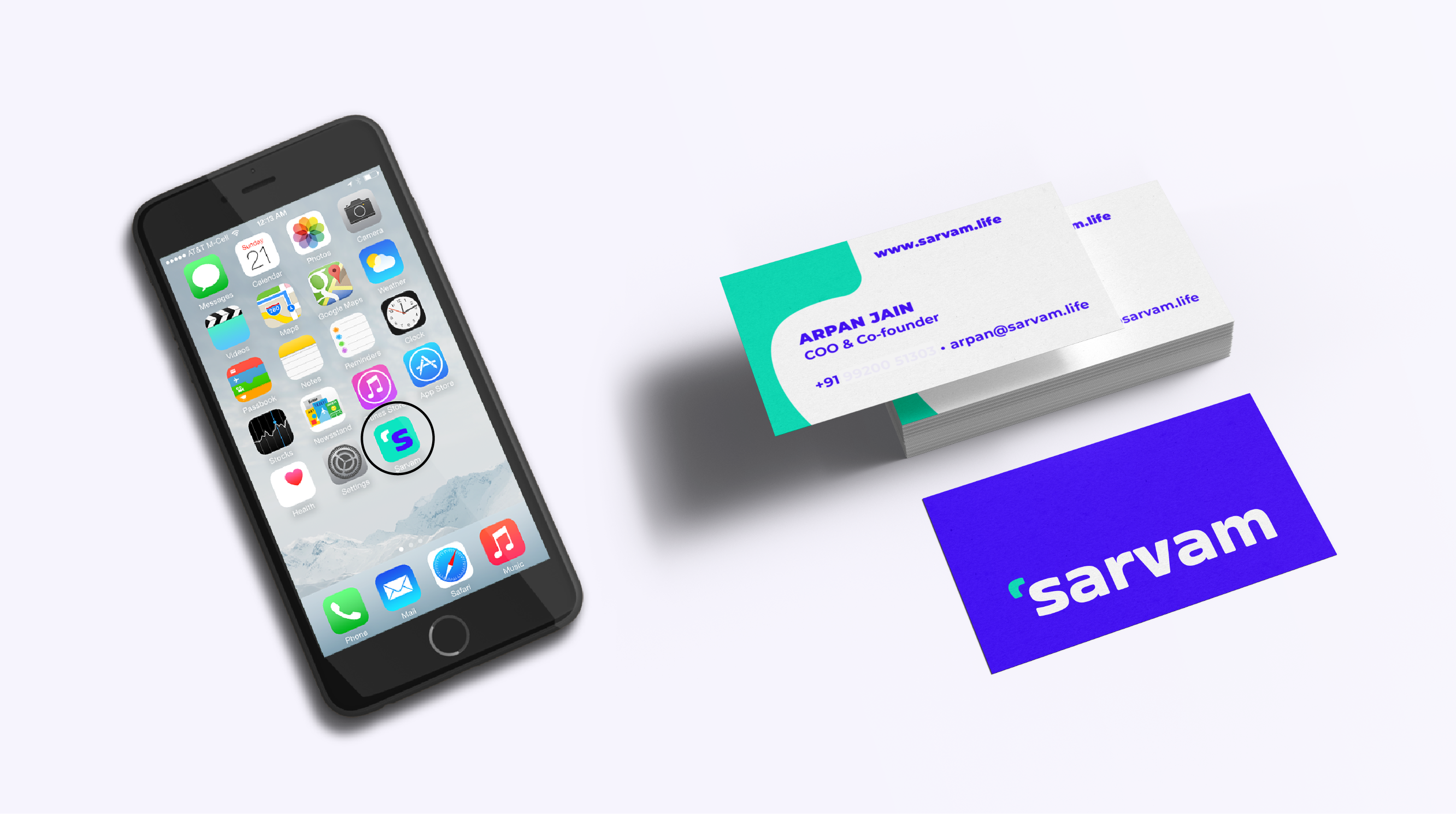
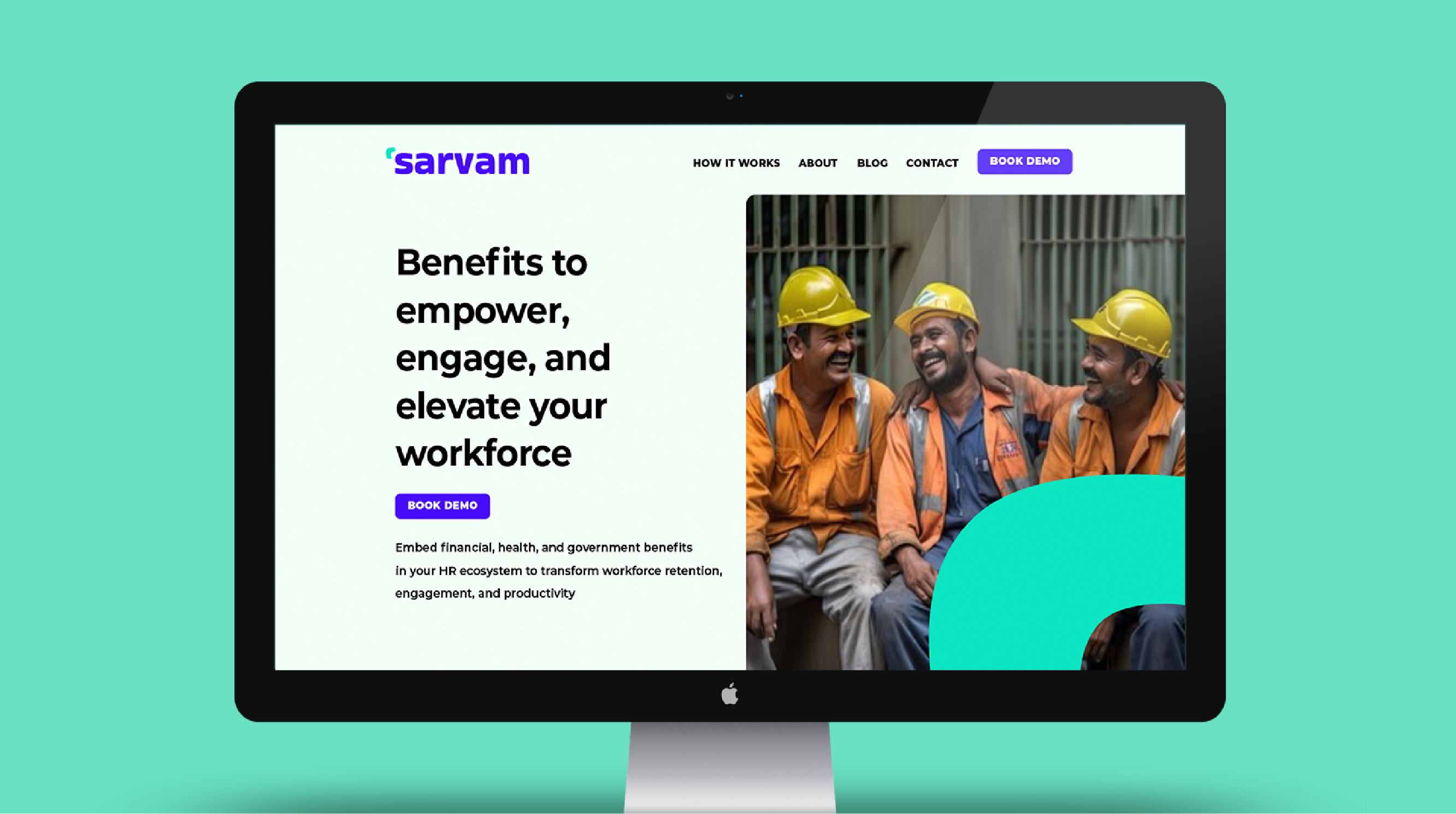
The India-based parent brand Entitled provides vital financial and health benefits, facilitating access for low-income workers to opportunities otherwise beyond reach.
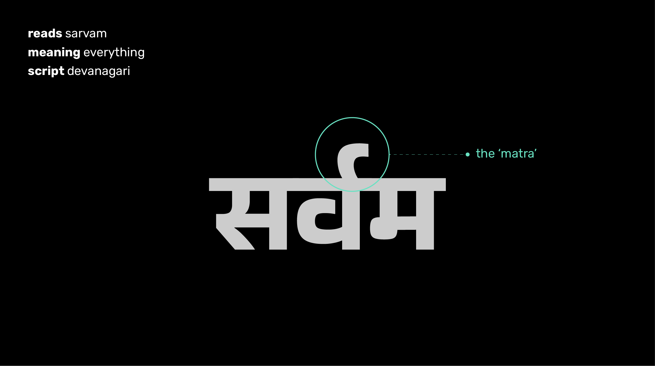
We had to rebrand showing a modern brand rooted in traditional values and inspire trust with the audience. With multiple workshops on naming, we chose ‘sarvam’ which means ‘everything’ in Hindi. Taking inspiration from the Devanagari script we used the ‘matra’ from the word and married it to Latin letters showing a seamless integration of both languages (’hinglish’ as spoken in India). The visual identity was built for digital-first use.
