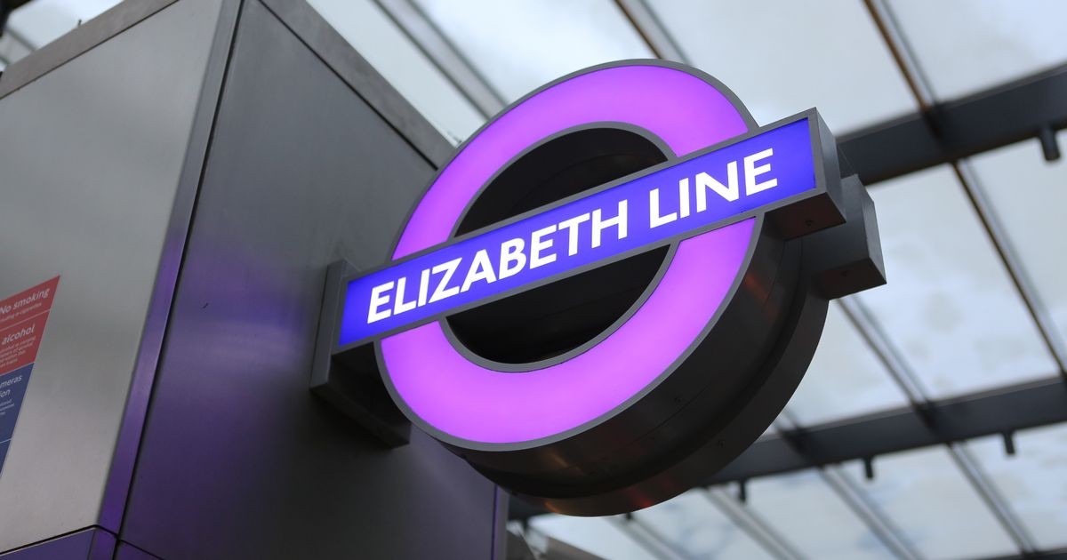
A marvelous feat of engineering, the Elizabeth line looks beautiful. The purple is vibrant, the stations modern, and the reactions exciting.
As a communication designer I was curious to see how it looks on the London tube map. That marvelous piece of design was crafted by Harry Beck, an electrical draftsman, in 1933.
Inspired by circuit diagrams, he designed a future-proofed system so robust it allows for growth. The ‘proof’ is how seamlessly the purple line slotted in almost a century later!
Beck’s map was a radical idea, but the iconic ‘tube map’ is now a universal template for wayfinding systems.
Any good design is based on two principles – simplicity and made for people. My favourite design writer Michael Beirut offers a short overview of the genius of the tube map and notes the amazing results that come from the cross-disciplinary approach.
Back to London. As student I used tube frequently: they’re memorable, convenient, and the most efficient travel system in the world.
Thinking about the tube map I’m reminded that our mission is to design for people – an obvious but overlooked fact. Be it graphics, products, or a platform – ALL design is for humans (okay, maybe some for animals).
If you’d like to share other unique systems designed for people, I’m all ears.